Sunday, September 25, 2011


Photo of Eiko and Koma dancing

I have not posted for a while. I am searching for a deeper level of content in my work, though I am not sure I can do it. I saw Eiko and Koma "dancing" at Skirball and I am amazed how they can convey strong emotion, artistic design, vulnerability and power. I would like to say the power is in their movement, which I cannot capture in a painting, but there is some of it in their still photos. You can see others at eikoandkoma.org.

Eiko (top) and Peace in Grain - Photo by David Fullard
Photo by David Fullard

They move very slowly, which gives you time to savor and fills me with expectancy about where they're going next, like watching a spring compress. Sometimes they feel like monks roaming the earth, or ghostly souls. At Skirball they moved through a foot of water in the very large lily pond, in the dark, with scant lighting refecting from water onto the wall behind, and a recording of crickets. Oh, I wish my painting could be so enveloping and a complete environment!



Monday, September 5, 2011

Long shadows


Setting Sun at O'Melvany Park 9x12 oil on board

I wondeer why we humans and artists love the golden hour, but not so much the golden years? There are technical attractions to the setting sunlight---long shadows make dramatic lines, and colors are warm and inviting. Backlighting is reminiscent of a dramatic stage, so the scene seems more important, designed for our enjoyment. Whatever ambitions we set in the morning are easing, whatever happened with the day is sufficient. Hopefully the same relaxation colors the golden years as well.

I was focusing on simplified shapes and varied greens at O'Melveny Park. There was a steady stream of hikers and dog walkers on the path and a lovely breeze.

Thursday, September 1, 2011

Leo Carrillo

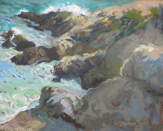
Leo Carrillo Sunlight 8x10 oil on board
One of my favorite art bloggers and artists is Qiang Huang at http://qiang-huang.blogspot.com/ , partly because he's so cheerful and sincere in his struggles. But reading about his working style makes me aware of how unusual it is for me to finish a painting in one day. It's partly that I rarely find a landscape with a perfect composition and have had a hard time making one with still life. (Maybe the problem is the word "still"! I realize it sounds dead to me, but Qiang's are not dead! or check out http://carolmarine.blogspot.com/ ) I always have to alter the empasis in my landscapes to makea pleasing composition and it takes me hours or days to see what's needed, to give up the prettiness in some areas so they don't distract from the main attraction. For you non artists, any area with a strong light/dark contrast or bright color will first grab attention, also small detailed shapes and wiggly lines. It doesn't matter if "that's how it really looked."  It's easier for me to sacrifice what was really there when I'm no longer looking at it and I've had a few hours or days to enjoy the magic of having captured it.

This ocean scene was nearly finished on the spot, but later I changed the large shapes of the rocks to simplify them, exaggerate the diagonals, not distract from the water. Now that I look at it there are too many masses the same size, see what I mean?

Sunday, August 21, 2011

Horses in the suburbs

Edge of the Suburbs 11x14 oil on canvas, NFS now
Nothing I worked on this week is "ready for prime time" yet, but here's another one from two months ago that I did for the "Rural Remants" show in a few months.I like to "expose my secrets" because I'm always wondering how other artists put a composition together or capture an interesting gesture or animal. This one was mostly from one photo, but I cut out one of the palm trees and a blue trash can in the lower right,  made the horse more orange and more sway back because I liked the curve, and I inserted the man raking from another photo because I wanted to pull the eye a little away from the horse. I made the dark horizontal boards darker because I liked that repeated design of the rails, steps and windows.
I was drawn to this shot because I liked the buildings in the background and, yes, that's the distant 118 freeway in a diagonal in the upper left. I didn't want them to be real obvious, but I wanted them there in spirit in order to balance the old rural feel we think is peaceful with the traffic and hustle we struggle with. Life is complicated, and I try to include a bit of that reality into most of my paintings.

Sunday, August 14, 2011

Full moon paintings

A few months ago I was inspired by David Gallup's comment that painting nocturnes helped his visual memory, because after looking at the color on his palette or in the scene he'd have to wait while eyes adjusted in order to mix a desired color. So I went hiking the last 3 full moons, looking for a spot and finding out where exactly the moon arises. I've learned a little about astonomy but so far the art project is even harder than I expected. For one thing, I had been searching for interesting tree and hill shapes, but when I went back to look at David's nocturnes (dgallup.com) I realized the interest is often in water reflections, clouds or an orange sky rather than the moon itself. No wonder I was struggling to make it interesting. So now I'm picturing a more magical lunar mood, not photographic, something shadowy and implying a lot you don't see for sure. I've come up with two ideas: outlines of hikers in the moonlight, and outlines of young dancers (that I photographed at the Y) superimposed on the silhouettes of trees. I'm a long ways from showing any results, but here's a long line of hikers from last night's hike in Thousand Oaks.

Monday, August 8, 2011

Trash goddess

Here's a poster I created about 9 months ago out of some of the trash I collected from the Limekiln creek, south of the 118 and just west of Tampa. I think a lot of it blows out of cars on the 118. When I first saw the plastic hanging from bushes like Christmas tinsel, I was just sad and mad. But I decided to do just what I could about it. Sometimes it would feel like kids searching for Easter eggs; as I looked around the creekbed I'd excitely spot another one! If the rest of my day was frustrating, at least I knew I'd done one purely good thing for the day. Over a year I estimate I collected about 3-4 trash cans full, 2 bags at a time, and the creek definitely looks more loved and unblemished. Now I go less often, in maintenance mode. BTW my art poster only lasted a couple days, I think the water and power company that owns the land and empties the (little used) trash can took it down, but maybe it was taken by a fellow art appreciator!

Sunday, August 7, 2011

Why do precise paintings feel "airless"?

In the art history class with John Paul Thornton last Wed I took the time to feel how art consumers felt who had never seen other pictures of foreign lands. We're so swamped with images nowadays, it's hard to imagine how different we'd respond to paintings like this one by Gerome of Whirling Dervishes, if there were no Arabic people living nearby, no photography, no constant newspaper articles about the Middle East, you knew nobody who'd been there, in fact most people in your neighborhood never traveled anywhere at all, and everyone you knew was either a Christian or a Jew. What crowds would gather around this painting, fascinated by every detail!

Gerome controlled the main Parisian art school and the Salon in which everyone wanted to exhibit. He was confrontational and uncompromising with the emerging Impressionists so there was no sharing, and his popularity petered out before he did. I've read that Impressionists were reacting against the "airless" precision of historical painting, and I think I can feel that in this example but it's hard to say why. Some of the figures are off-balance, seemingly life-like, yet they seem stiffly frozen. Maybe soft edges feel more like motion because we're used to photographic blurring. Or maybe we know that in the time it takes to roam this room and look at each figure, they would all have moved around. Any other ideas?